ux/ui design
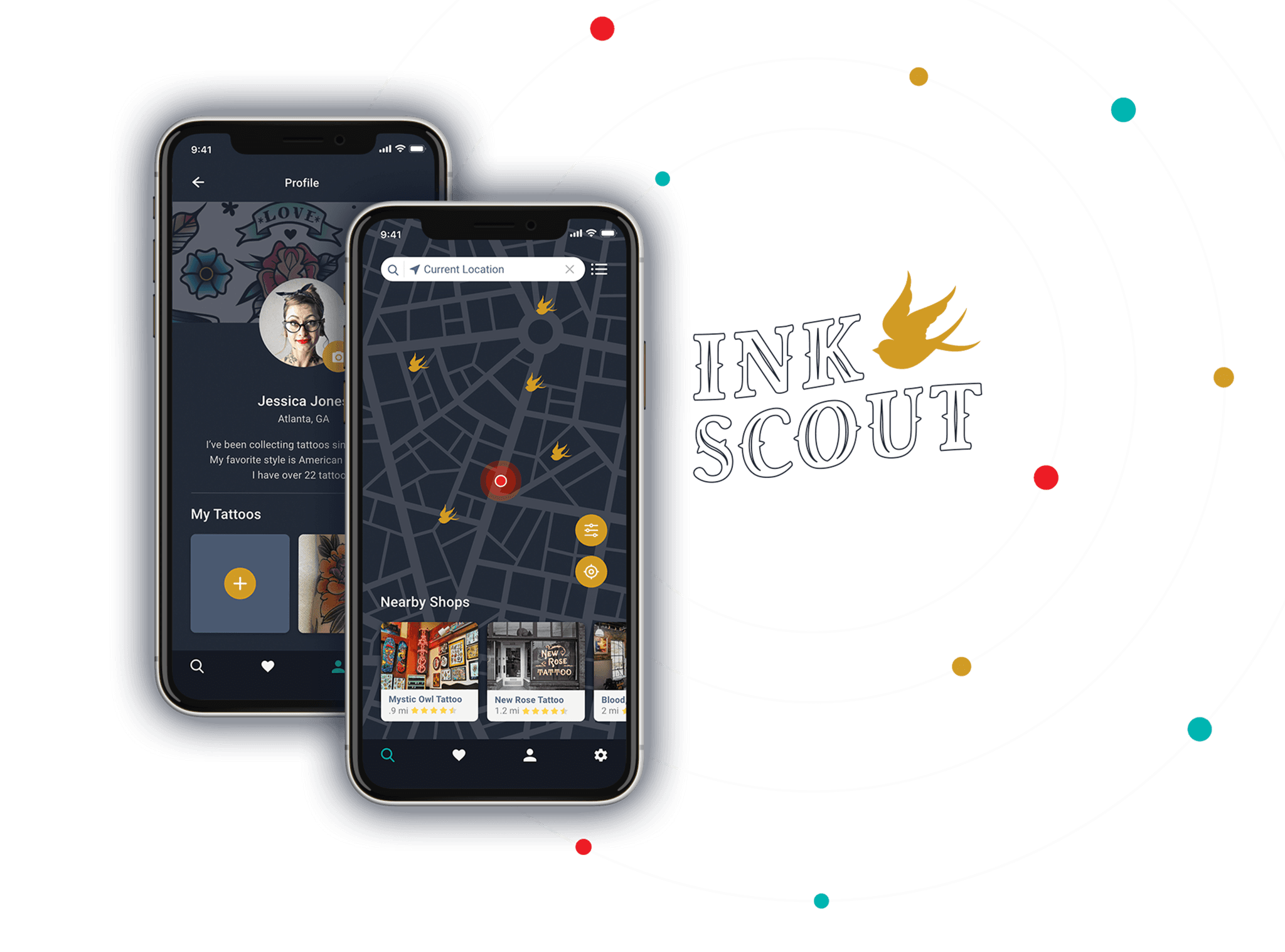
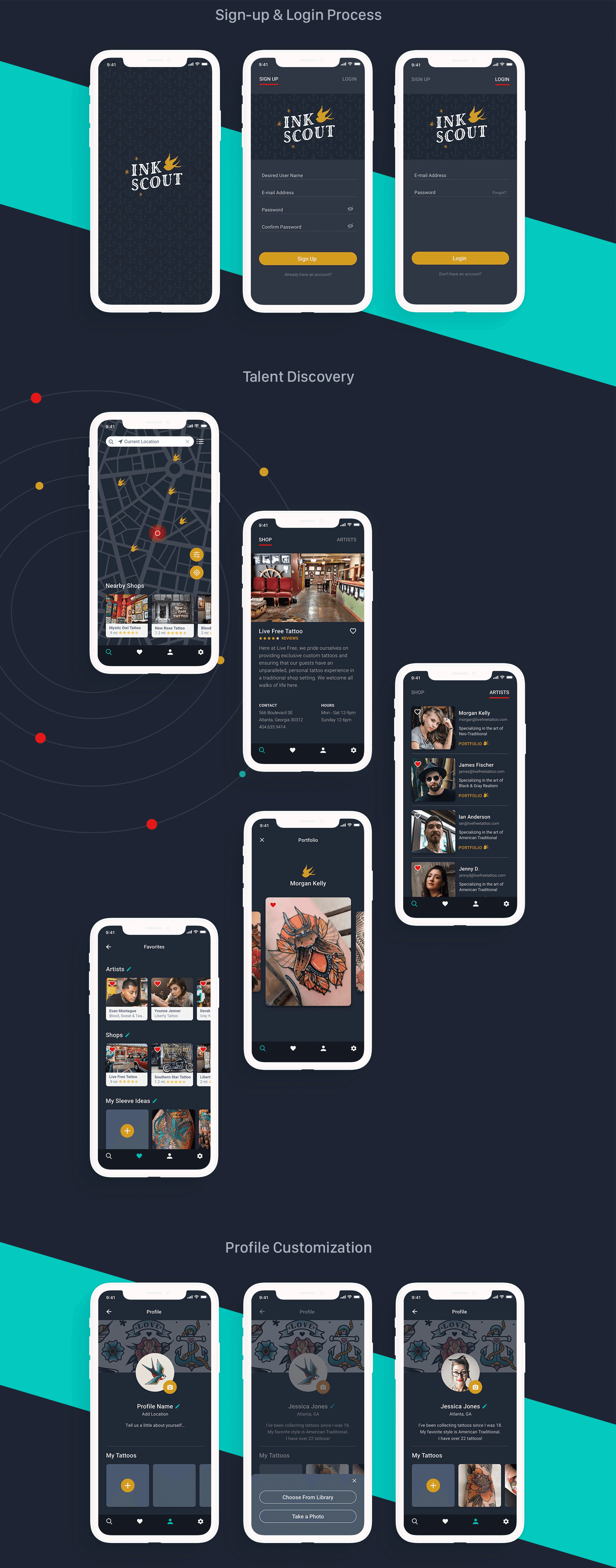
InkScout
During my studies at CareerFoundry, I was tasked to design a mobile app for an industry of my choice. This project allowed me to apply my newly acquired UX/UI skills by conducting research, creating wireframes, and developing prototypes. I collaborated with fellow students to gather feedback, iterating on my designs to enhance user experience. This project deepened my understanding of user-centered design and the importance of meeting user needs.
MOCk company
InkScout
Skills
User Experience
UX Research
Wireframing
UI Design
Industry
Geolocation App
Date
2020
Context
Choosing your next tattoo is a serious matter. After all, tattoos are permanent! Generally speaking, people don’t know where to get their next tattoo idea executed and often ask for recommendations from random people sporting nice tattoos. An artist recommendation often happens by word-of-mouth. People could also search endless hours on social media for the perfect design and artist, only to realize the artist lives overseas.
Objective
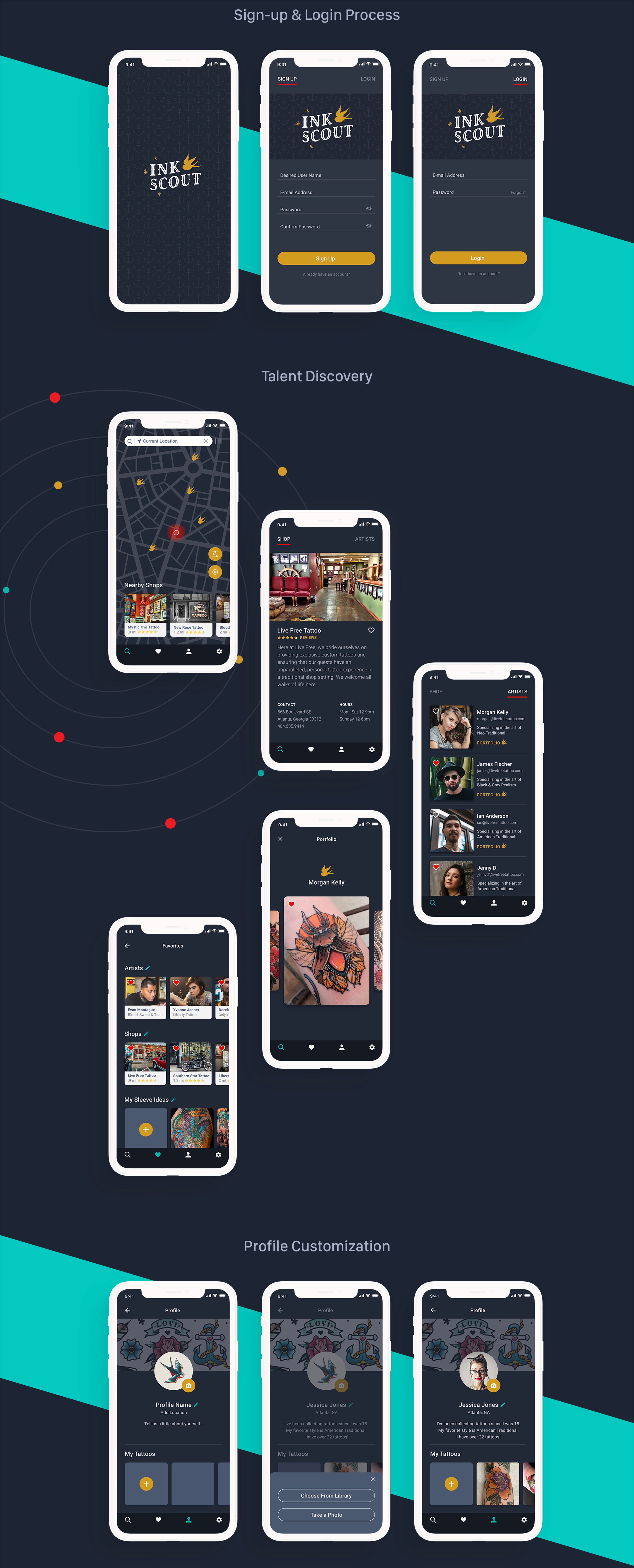
The objective was to create a location-based app for people anywhere in the United States looking for quality tattooers, whether they are travelling or in their home town. Users will be able to view a tattooer’s biography, a curated portfolio, pricing and contact information. Users will have access to reviews and ratings, which will aid them in their decision-making process.
SWOT Analysis
Strength: Massive following, world-wide search and a clean user interface.
Weakness: All the good artist they show seem to be overseas. The one’s that show up in local areas are not well known artists and have bad photography to “showcase” their work. Also, the homepage seems to recommend the same artists every time.
Opportunity: Getting the best artists and shops in major cities to use this platform to promote their work. It seems only second rate tattooers are on this platform. Recommending artists in bordering states based on your style preference. If you are not careful users can get confused as to where artists are from.
Threats: Tattoodoo does not have many other competitors delivering this type of content. After speaking with tattooers, Instagram is the portfolio platform of choice. There is a lot of critique about the apps’ usefulness from a tattooers perspective.
UX Analysis
Usability: The app is very easy to use, but the full site is a much better experience.
Layout: Very clean, almost too sparse. General text hierarchy could be more clear.
Navigation Structure: Search and messages are at the top and the main nav is at the bottom. They’re easily located.
Compatibility: It works across all platforms–Android or iPhone.
Differentiation: The curated content is beautiful, but where the magic falls apart is with the local artist promotions. They do have a global reach, which sets them apart.
Calls-to-Action: The main CTA is “Book” an artist and it is prominent.
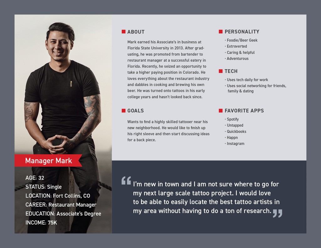
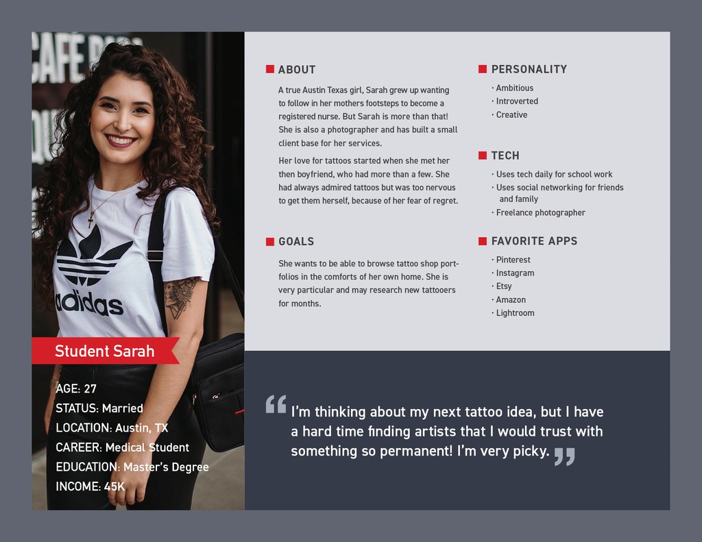
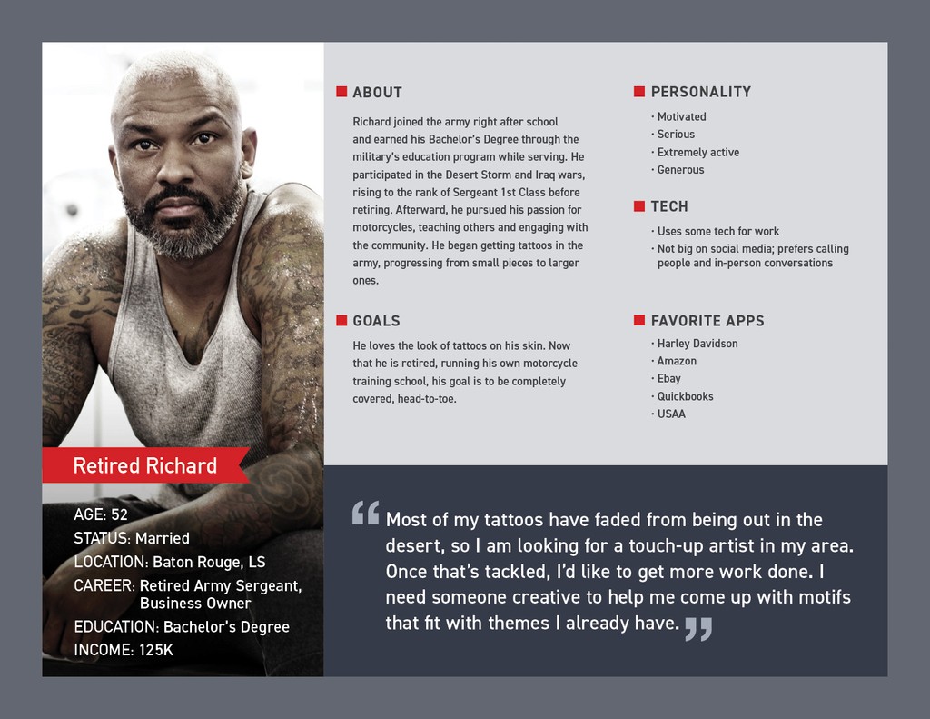
USER PERSONAS
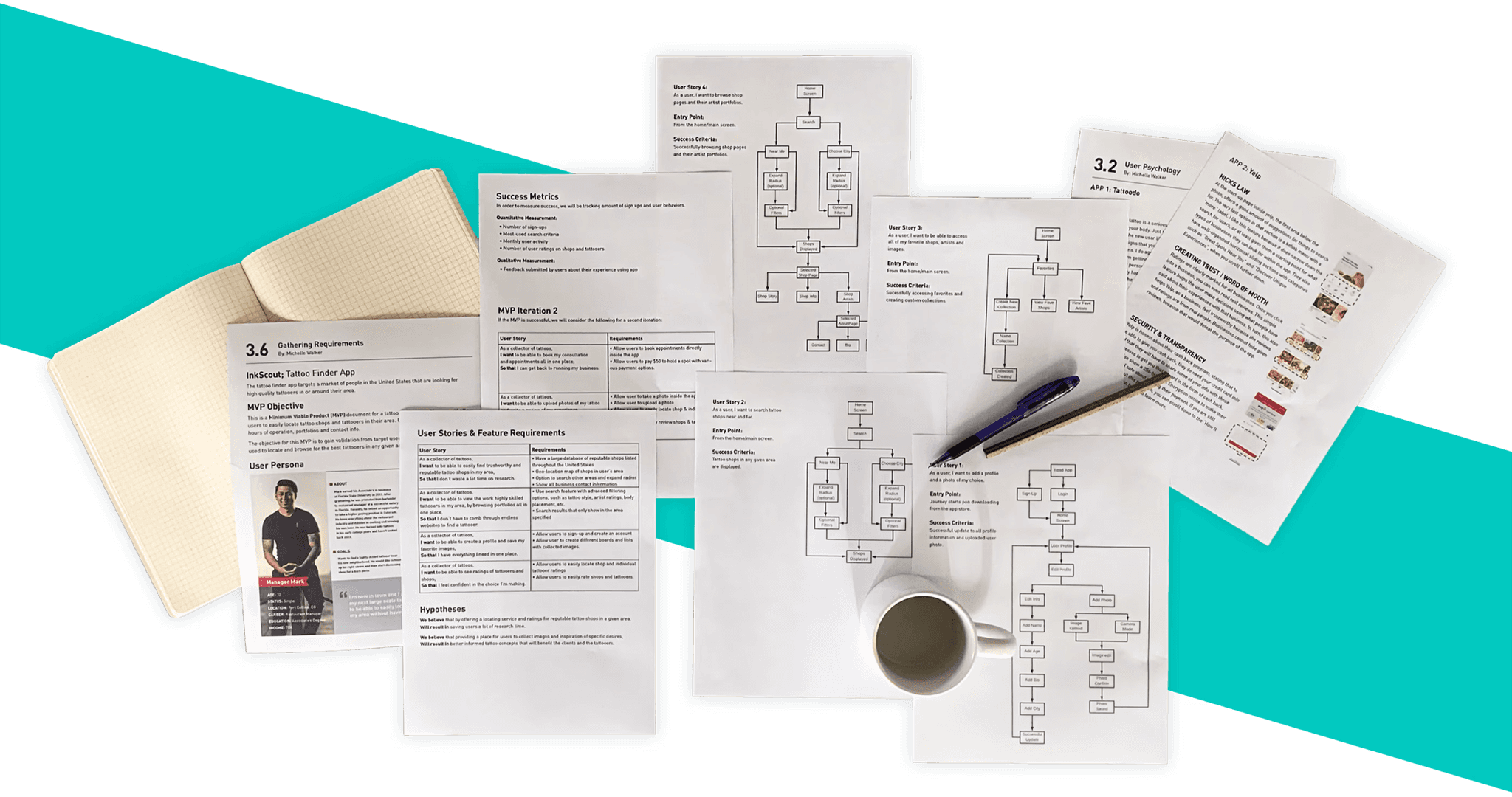
USER FLOWS & MVP
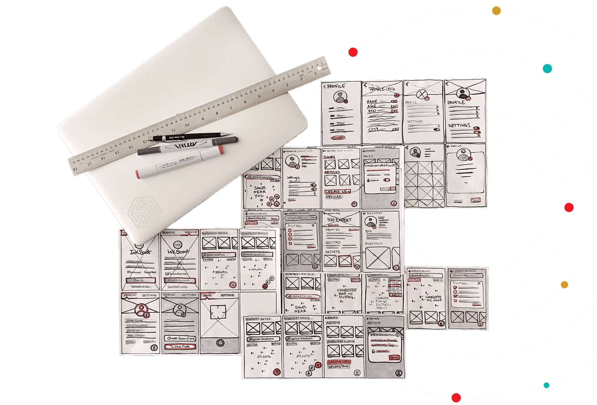
SKETCHES
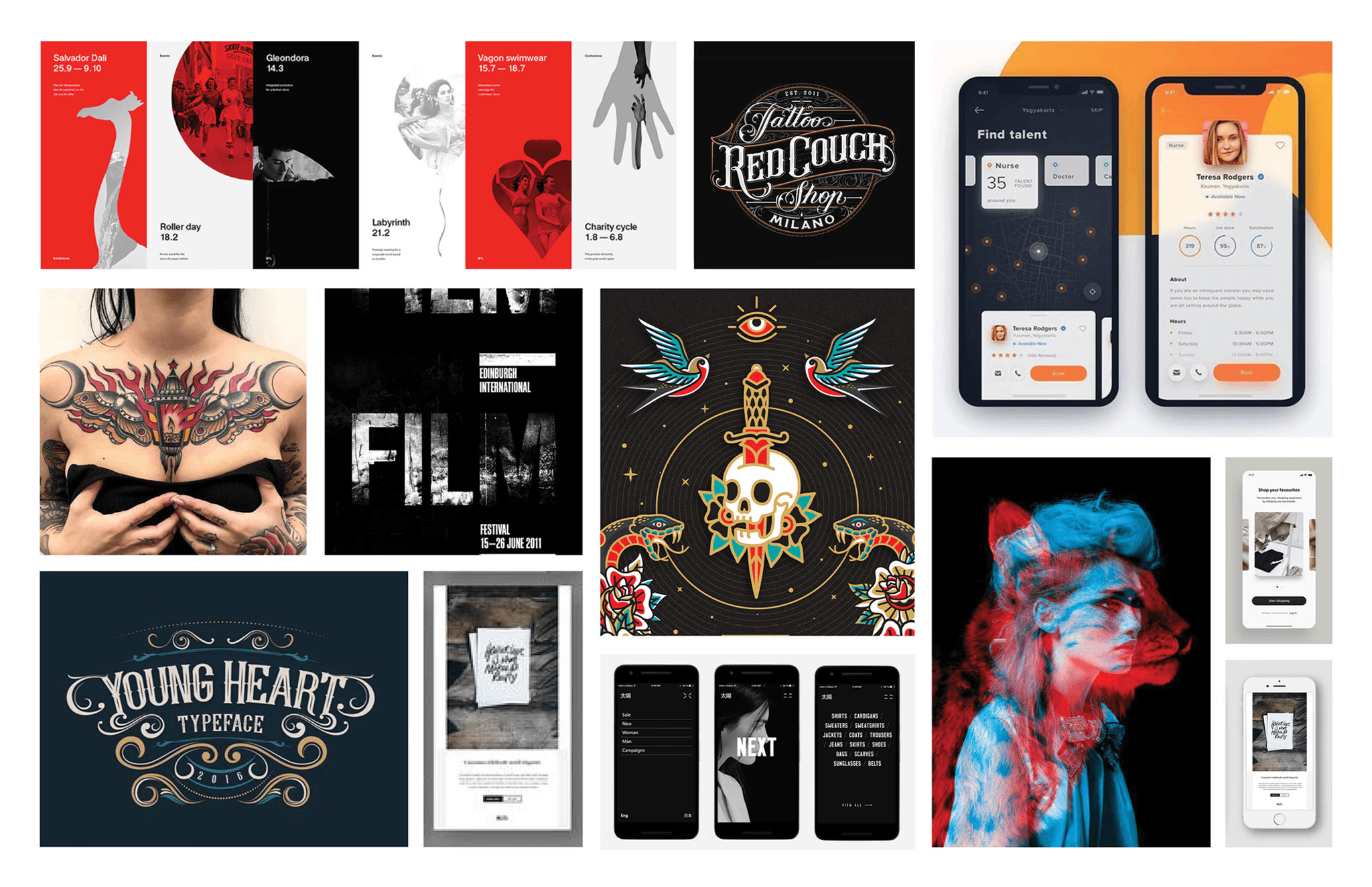
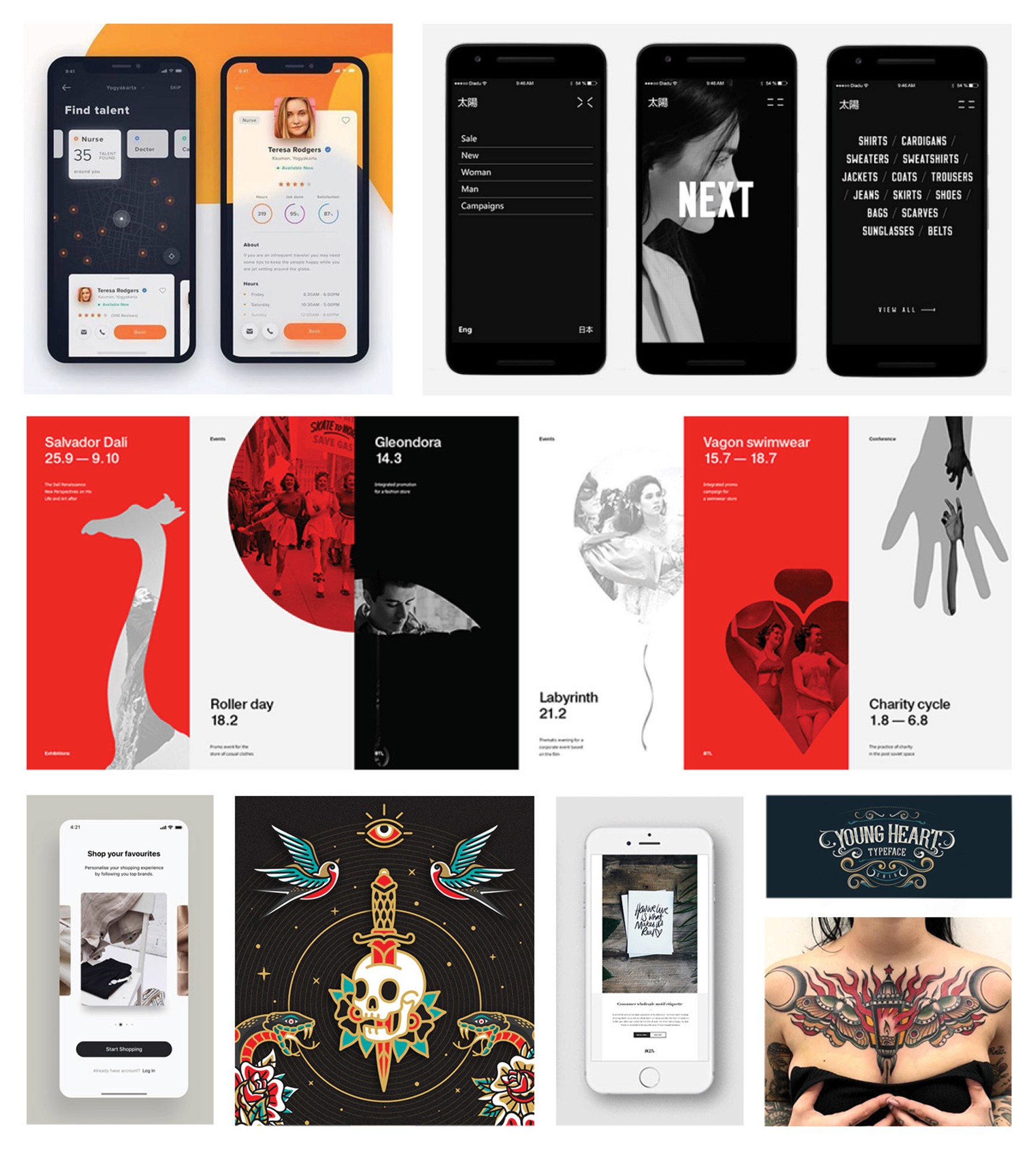
MOODBOARD
PREFERENCE TESTING
The Question
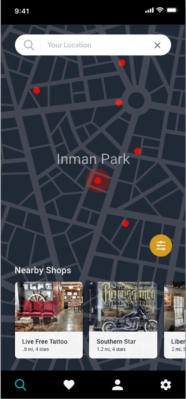
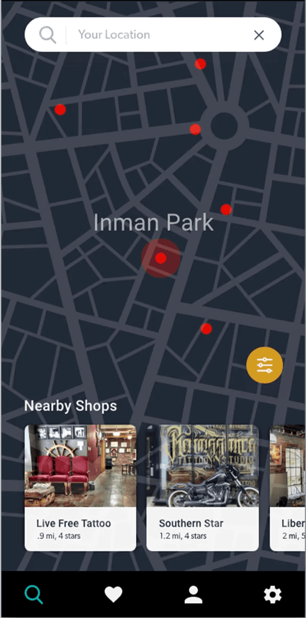
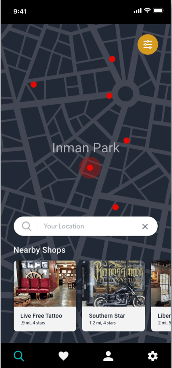
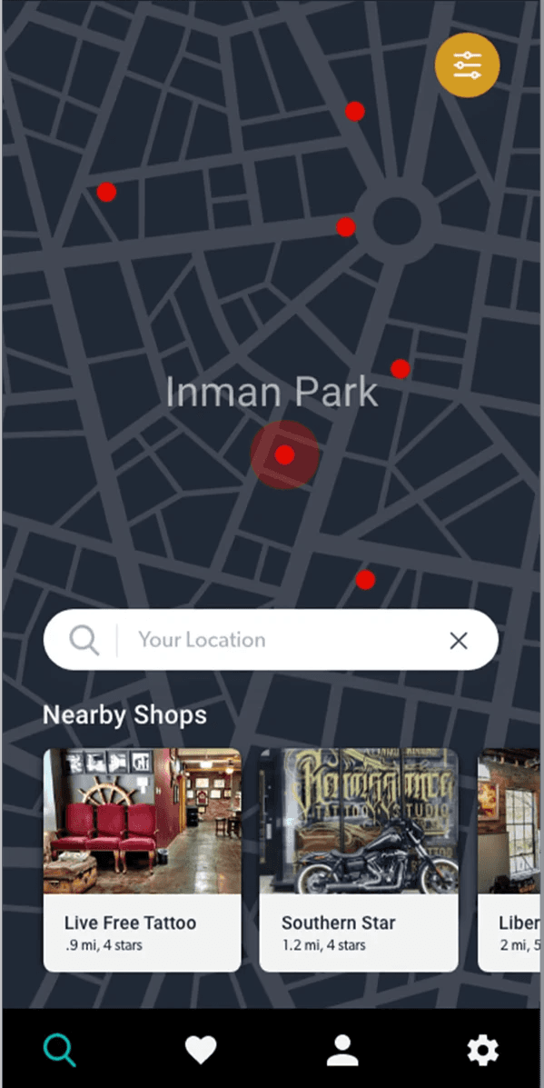
Do users prefer the search field placed at the top of the screen or two-third’s down?
The Reason
After researching geo-location based services, like Lyft and Uber, I noticed the search bar was placed closer to the bottom, rather than at the top of the screen. Soon realizing this is because our thumbs, when holding a mobile device, can easily reach this area without having to enlist the other hand.
The Winner
The winner was clear – the control image won. People found the placement more familiar.
